Packaging is a canvas for creativity. For decades, the norm has been designs that scream “Over here!” with loud colors, bold typography, and wild patterns. It was sensory overload, and companies thought they needed to shout to stand out in the saturated market. Recently, however, minimalist packaging has seen a rise in popularity.
Minimalism is a sleek, stripped-down look that creates breathing space for the design and lets the product shine through. Minimalist packaging embodies the “less is more” principle by cutting down on the clutter.
The projected growth of sustainable packaging to $423.56 billion by 2029 signifies a substantial shift in consumer and business behavior towards sustainability. This approach also indicates a growing consciousness towards the environmental impact of physical goods. When it comes to consumer products, minimalist packaging is at the forefront of sustainable practices.
An Overview of Minimalist Packaging
In today’s saturated packaging industry, minimalist packaging designs promote simplicity, sustainability, and clear communication. By removing excessive layers and information, minimalist designs focus on the basic essence of the product. This often leads to a sleek and refined look. Minimalist packaging isn’t just a passing trend; it mirrors a shift in consumer values. It attracts environmentally-conscious consumers who appreciate transparency and efficiency.
There are two aspects to minimalist design:
- Eco-Friendly Packaging: This focuses on using minimal and environmentally sustainable materials.
- Visual Appearance: Minimalist branding and elegant graphic design create a clean, uncluttered look.
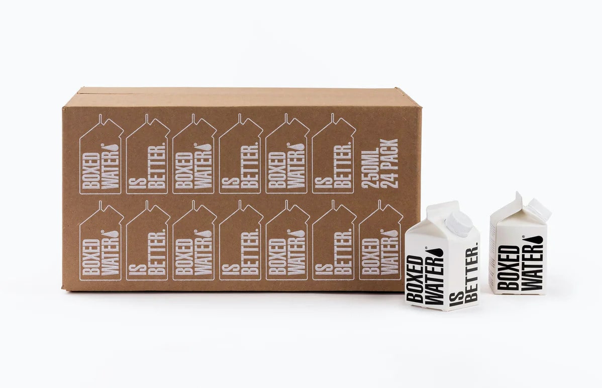
Minimalist packaging streamlines elements, such as employing one impactful typography or a single color for the entire packaging, and avoids clunky text or complex visuals. This design conveys the brand story and engages consumers with minimal distractions.
5 Benefits of Minimalist Packaging Design
Many companies find it challenging to switch to minimalist packaging. Let’s explore the key benefits of minimal packaging design to understand how less is more.
1. Minimize Eco Footprints
A massive chunk of packaging waste winds up in landfills. Every fancy box, excessive plastic wrap, and unnecessary filler leaves a hefty carbon footprint.
Minimalist packaging uses less material, which means a lighter environmental impact. It’s often made with recyclable or compostable materials like cardboard or kraft paper, making it easier to ditch the dump and embrace the recycling bin.
2. Economical Packaging Solutions
Think of each layer of unnecessary packaging as a tax on your bottom line. Think about it—fewer resources used in manufacturing result in a direct impact on your expenses. Beyond manufacturing costs, a minimalist design can also slash your shipping, storage, and logistics costs.
3. Improved Shelf Presence
In the bustling aisles of a store, where numerous products compete for attention, shelf presence is crucial. Minimalist packaging design steps up to the challenge by prioritizing clarity. Picture sleek, simple lines made from environmentally friendly paper materials, adorned with a bold brand logo and necessary product details. This straightforwardness acts as a visual attraction, guiding the gaze towards the clean elegance of your product.
4. Solidify Brand Image
Minimalist packaging can reinforce your brand image through its simplicity and clarity, which enhance the product’s appeal and visibility. Transparency can further strengthen the brand image by showcasing the product’s authenticity, which aligns with 74% of consumers who prefer brand honesty and sustainability.
Moreover, diverse types of packaging can tell different stories. For instance, a minimalist glass bottle conveys elegance and luxury, while a minimalist paper bag evokes a sense of rustic charm. Both minimal packaging approaches define the brand’s unique style.
5. Enhance Customer Experience
A survey showed that 60 to 80% of consumers admit to switching brands due to dissatisfaction with packaging. Ripped tabs, cryptic instructions, and mountains of unnecessary plastic aren’t exactly a recipe for a great unboxing experience.
Adopting a minimalist design is a strategic move to avoid overwhelming and off-putting packaging that might drive customers away. And just because we’re keeping things sleek doesn’t mean the wow factor is gone. Small additions like a personalized thank you note or a freebie make the experience more enjoyable.
6 Key Design Elements of Minimalist Packaging
Minimalist packaging design possesses defining characteristics that ensure the product takes center stage while providing ample protection. Here’s an overview:
|
KEY DESIGN ELEMENT
|
CHARACTERISTICS
|
|
Limited Color Palette
|
A restrained selection of colors is employed to maintain simplicity and focus.
|
|
Negative Space
|
Intentional empty areas surrounding design elements are used to reduce clutter.
|
|
Typography
|
Clean and legible fonts are chosen for a refined and straightforward presentation.
|
|
Texture
|
A tactile dimension is introduced to heighten the overall sensory experience.
|
|
Logo Placement
|
Balancing visibility and subtlety is a crucial consideration.
|
|
Functionality
|
Every element in the design serves a specific purpose.
|
1. Limited Color Palette
One key design element that stands out is a limited color palette. This approach—often rooted in the RGB color model—focuses on simplicity and subtlety.
Minimalist packaging picks a few well-chosen shades to deliver its message. Take Glossier’s millennial pink hue with a touch of white as an example. The soft-muted shade resonates with the preference of the millennial demographic.
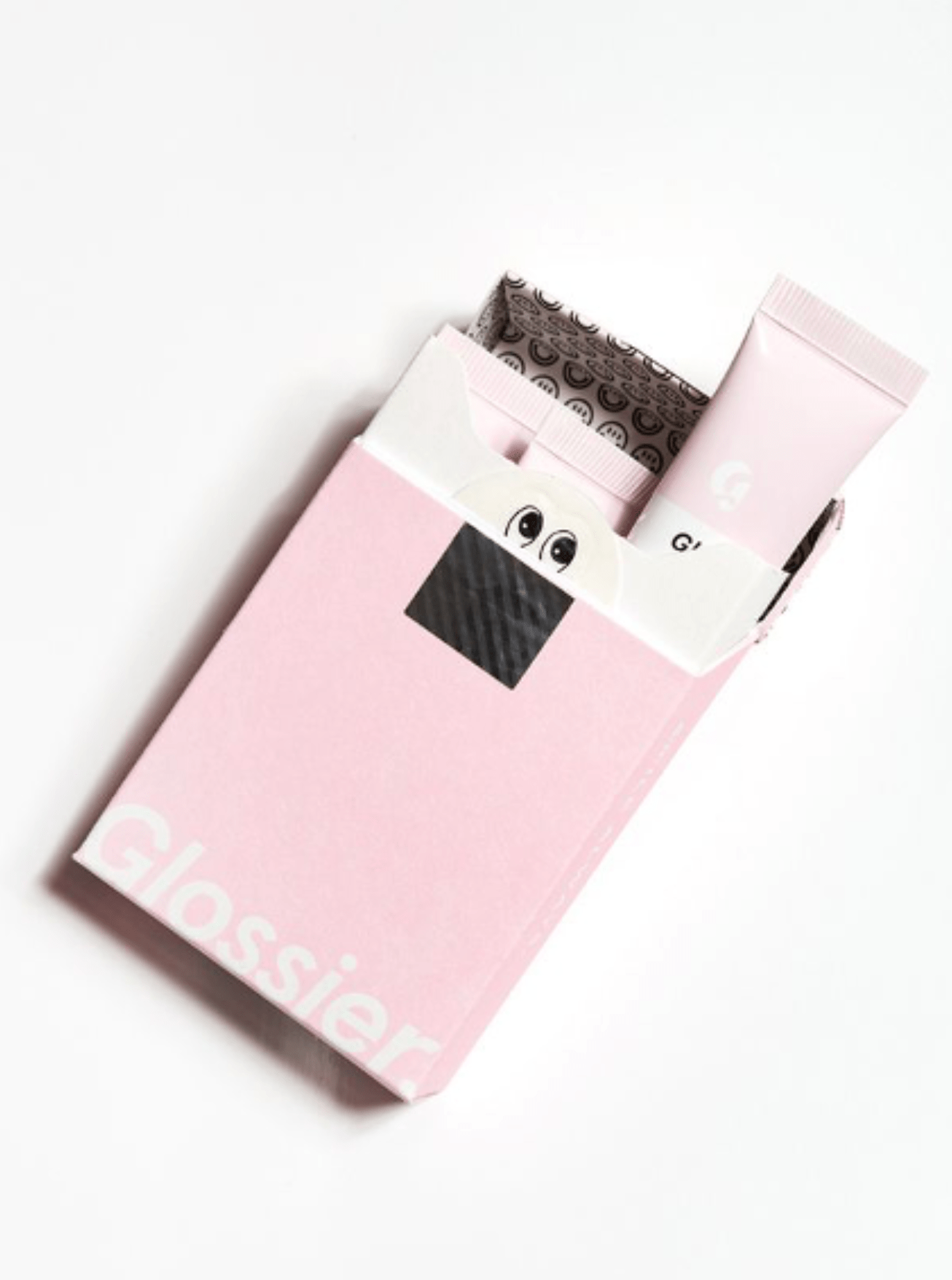
Best practices for mastering a limited color palette:
- Pick a hero: Choose one dominant color that embodies your brand. Think earthy brown for organic coffee beans or a vibrant orange for a playful kids’ toy.
- Embrace neutrals: Use white, black, or gray as supporting acts. They balance the hero color and provide a clean canvas for essential information.
- Consider pops: A surprising accent color can add intrigue—a splash of lime on a dark chocolate bar or a touch of silver on a minimalist notebook. Just remember to keep it simple.
2. Negative or White Space
Also known as white space, negative space refers to the intentionally empty areas surrounding design elements to achieve a clean and uncluttered look. While it might sound counterintuitive, embracing the “less” in these areas can amplify the “more” of your brand. A good example is Apple’s minimalist ethos, reflected in the neat and minimal packaging of their devices.
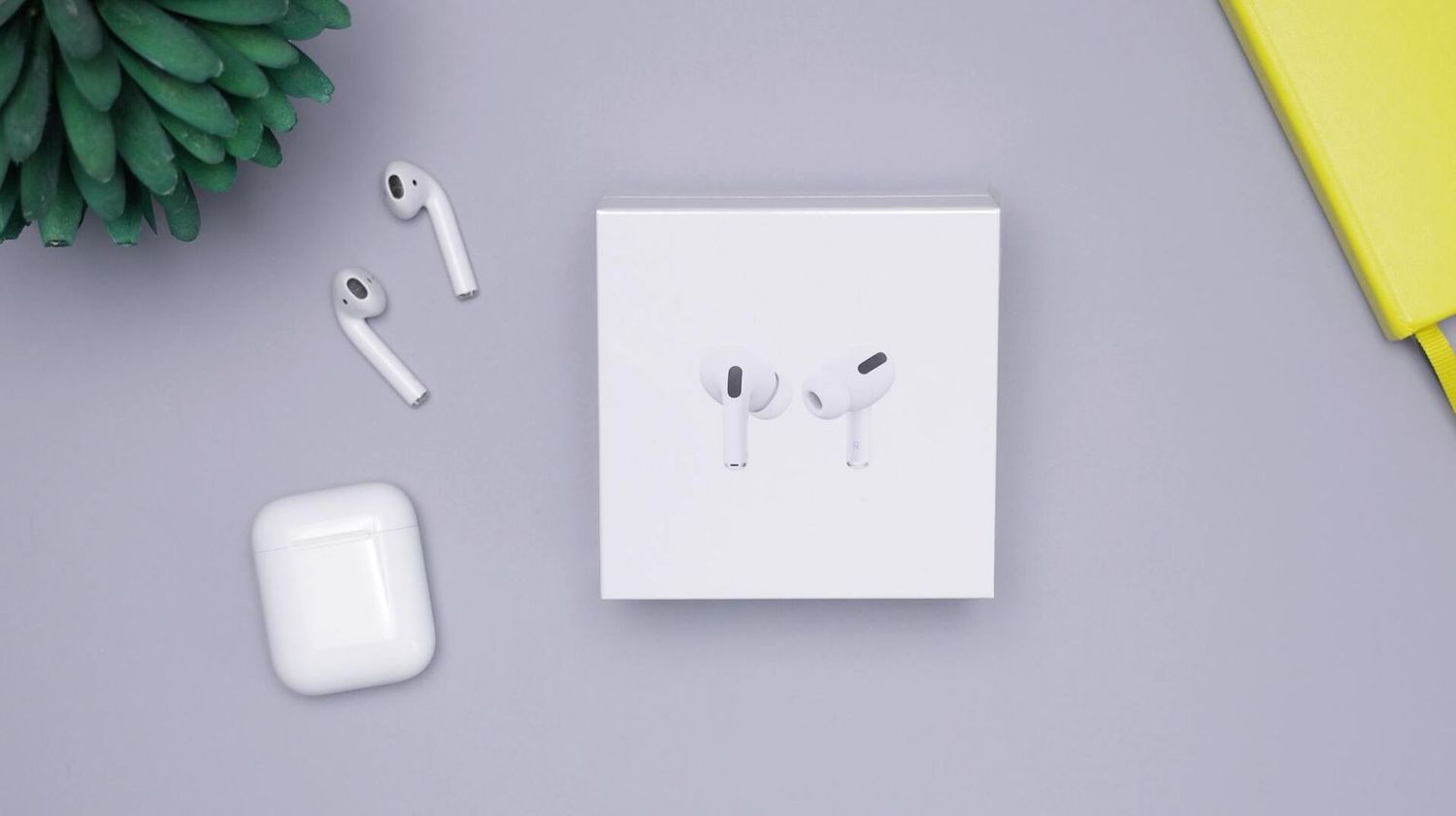
Best practices for making negative space your ally:
- Frame the focus: Think of negative space as a gallery wall for your product. Give it breathing room, and let its natural beauty and unique features command attention.
- Balance the elements: Don’t let your logo or text get lost in the emptiness. Position them strategically and use negative space to guide the eye towards them.
- Practice uniformity: Keep the spacing consistent in the packaging for a polished and cohesive design.
3. Typography
Clean and balanced fonts create a sophisticated and neat aesthetic. A simple sans-serif font for product information makes it easy to understand. Many fonts are suited for minimalist design, so it’s important to pick one that strengthens your brand identity.
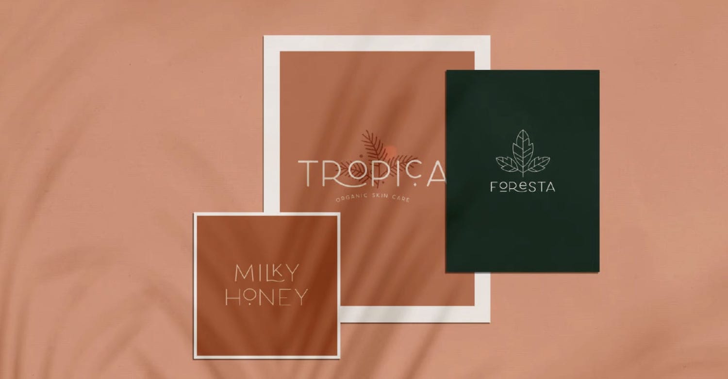
Best practices for minimalist typography magic:
- Less is truly more: Stick to one or two fonts, choosing styles that complement each other and your brand personality.
- Clarity before creativity: Focus on readability first. Choose clean, well-spaced fonts that are easily understood.
- Test them out: Play with subtle variations in size, weight, and even color to add depth and visual hierarchy.
4. Texture
Texture adds depth, dimension, and a touch of intrigue, transforming simple packaging into a sensory experience. Minimalist designs use layers, raised edges, textured paper, and materials that mimic the feel of natural elements like wood.
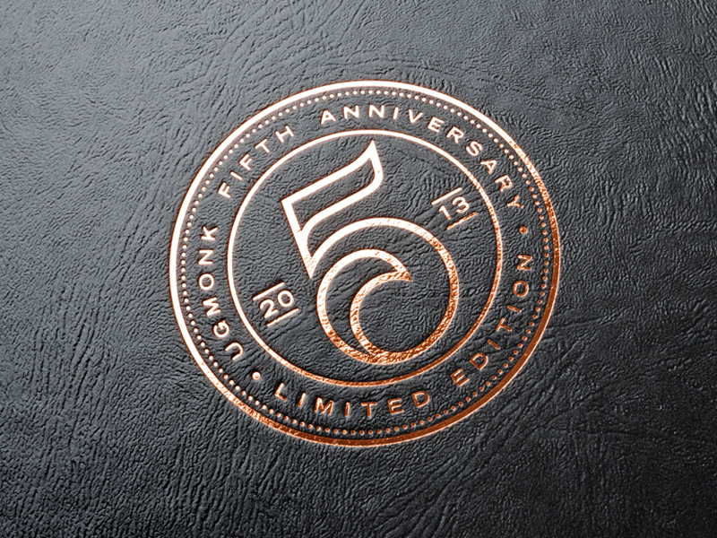
Best practices for textured minimalism:
- Highlight key features: Use textured elements to spotlight crucial information like your brand logo or product name.
- Embrace natural materials: Untreated paper, woodgrain, and fabric can add an earthy elegance to your packaging. These textures evoke a sense of authenticity and quality.
- Play with patterns: Don’t shy away from subtle embossing or debossed patterns. Geometric shapes, organic lines, or product-inspired motifs can add visual interest without overwhelming the minimalist vibe.
5. Logo Placement
Your logo is a beacon that draws attention and anchors your brand identity. Its placement on your packaging can provide a significant visual impact. Here are some examples of logo placement:
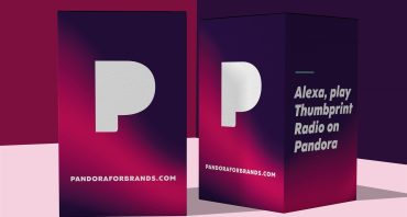
- A central placement exudes confidence and simplicity. It works brilliantly for bold logos that can hold their own in the vast negative space.
- An off-center placement can create a dynamic tension that draws the eye and invites exploration. It’s particularly effective for logos with playful elements or those that benefit from negative space.
- Placing your logo in the corner adds sophistication and creates curiosity, suggesting a story to be discovered.
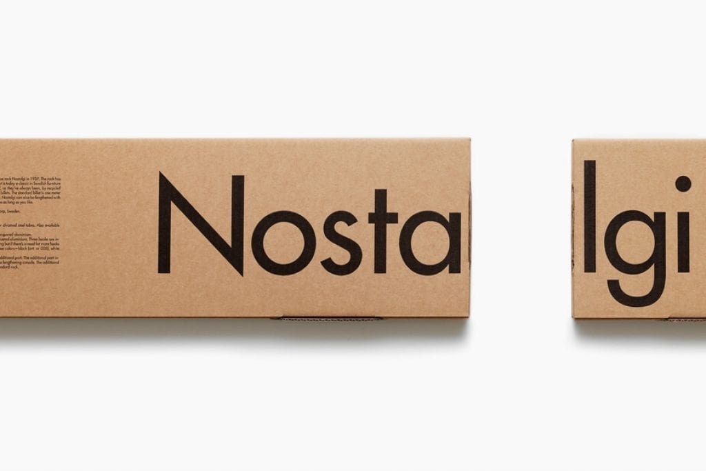
Best practices for the proper logo placement:
- Scale Matters: Ensure your logo is appropriately sized for the packaging. Too small, and it gets lost; too large, and it overpowers.
- Color Harmony: Consider the interplay of your logo’s color and packaging. Striking contrast can make it pop, while tonal harmony can create a cohesive look.
- Readability First: Always prioritize visibility. Avoid placing your logo near busy patterns or overlapping with essential information.
6. Functional Design
More than the aesthetic, functionality is the bedrock of minimalist packaging. Every element must serve a purpose. That way, the packaging becomes an integral part of the product journey.
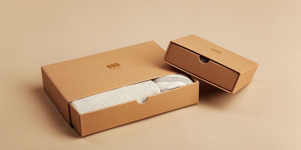
Best practices for making function your friend:
- Function takes precedence over form: Trendy shapes won’t benefit your product if they compromise usability. Consider how your packaging will be opened, stored, and shared digitally.
- Welcome sustainability: Look for a design that minimizes waste, like reusable closures, and choose recyclable materials.
- Prioritize convenience: Small functions like a simple pull tab on a box can greatly impact brand perception.
4 Popular Types of Packaging for Minimalist Design
Not only should your minimalist packaging save the planet, but it must also protect your product.
1. Tuck End Boxes
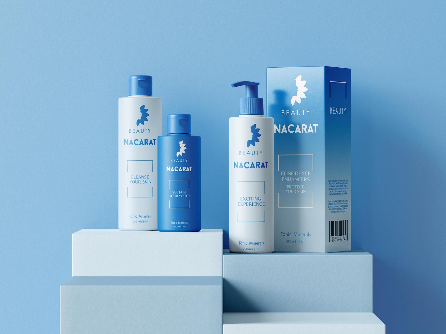
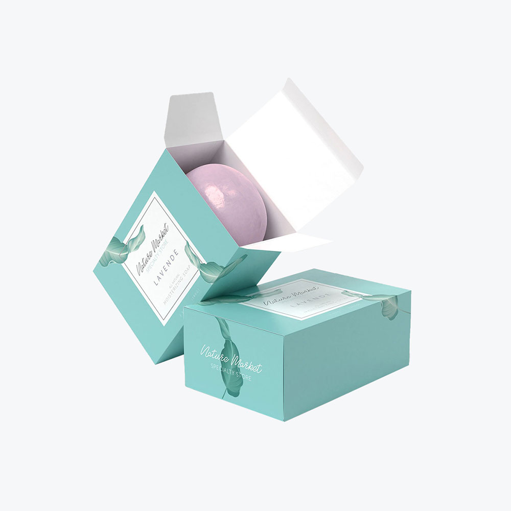
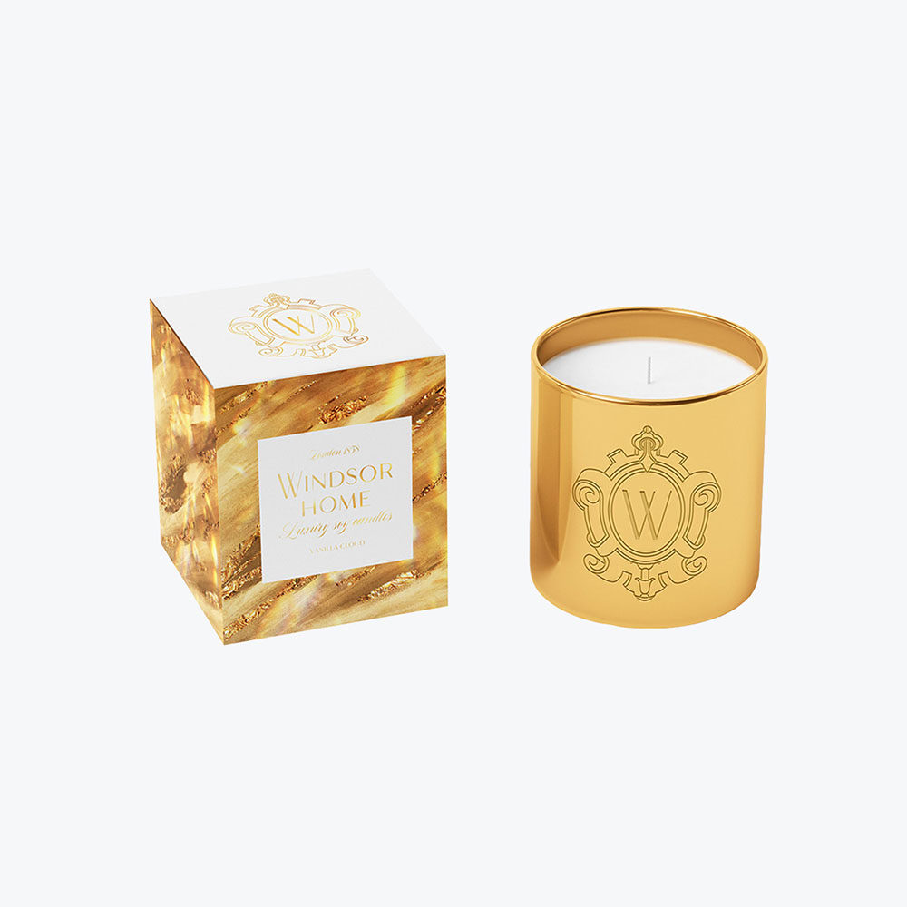
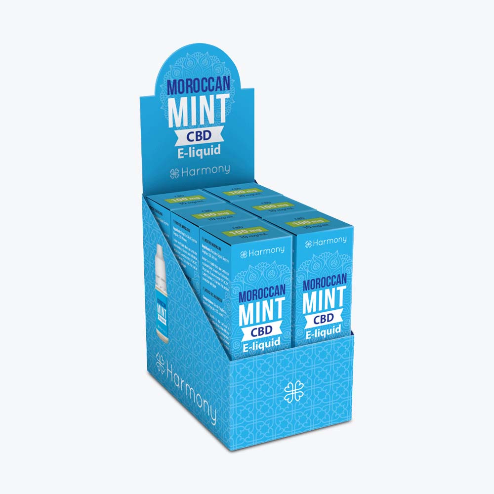
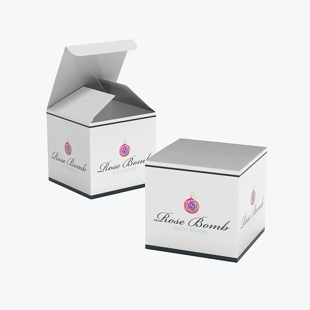
A tuck end box is a single sheet of paperboard folded to precision, with flaps that tuck in for closure. Its surfaces offer a great canvas for your brand’s logo. Eco-friendly tuck end boxes come in various shapes and sizes and can safely store anything from delicate jewelry to chunky candles. They can be dressed with a touch of foil or left bare for a raw, natural look.
2. Mailer Box
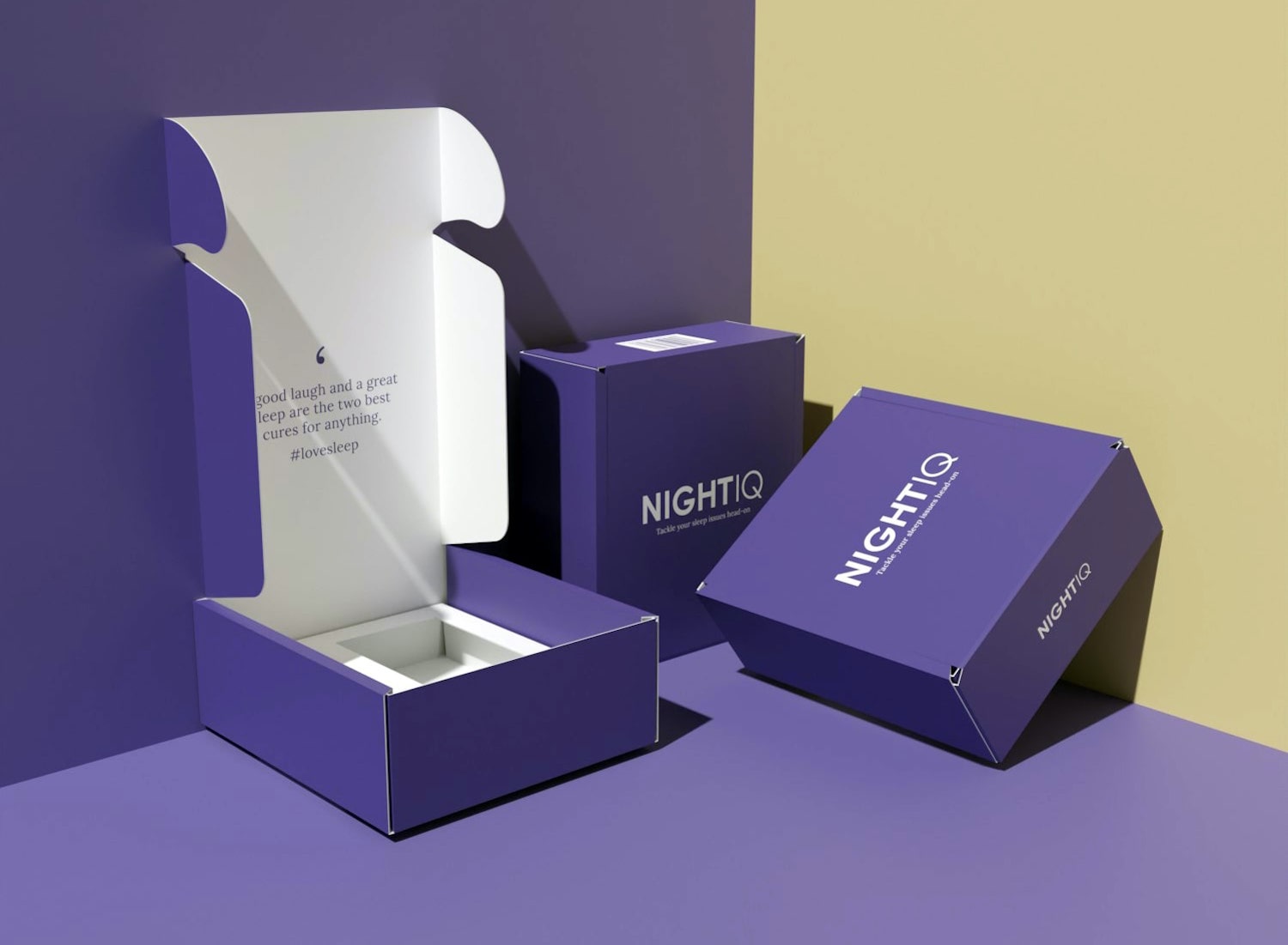
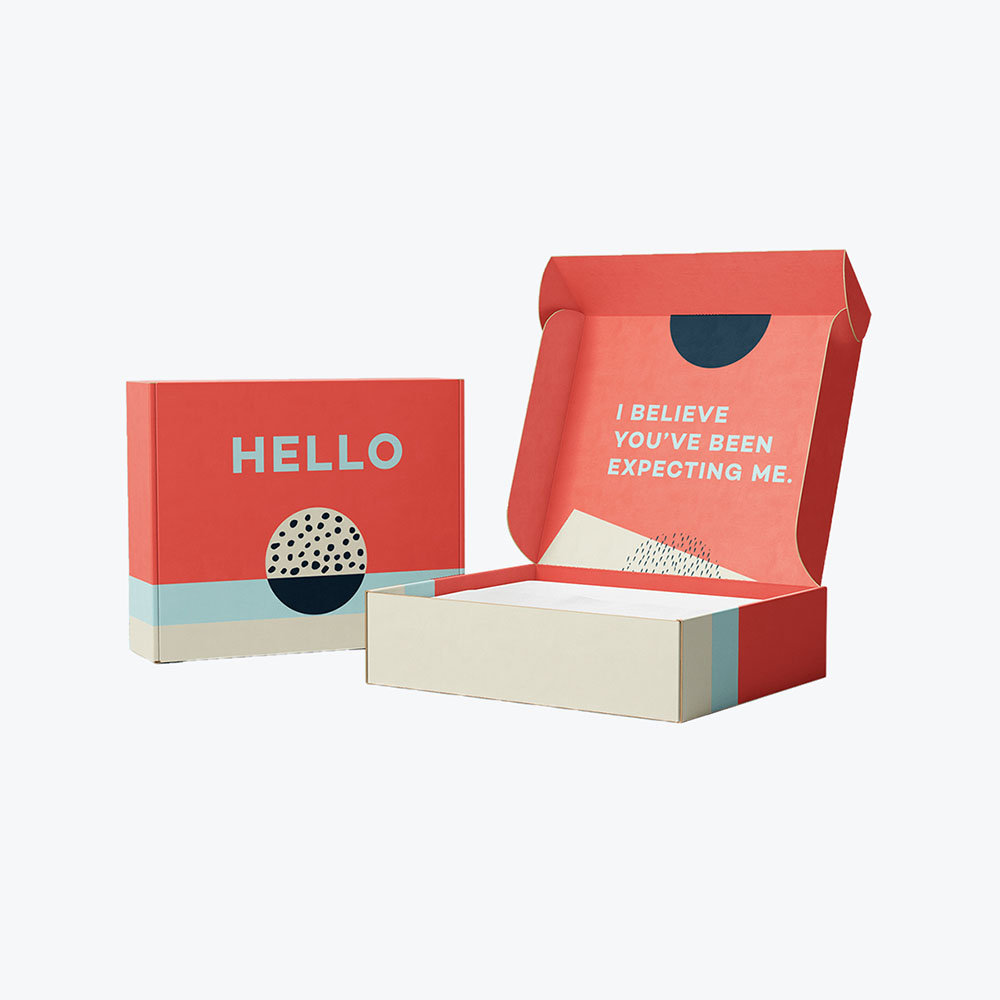
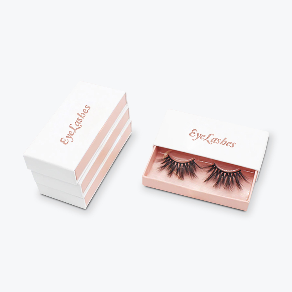
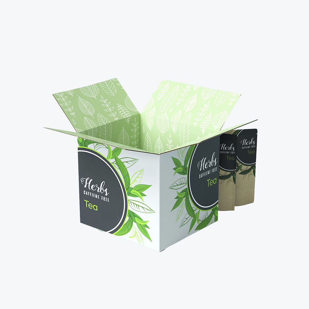
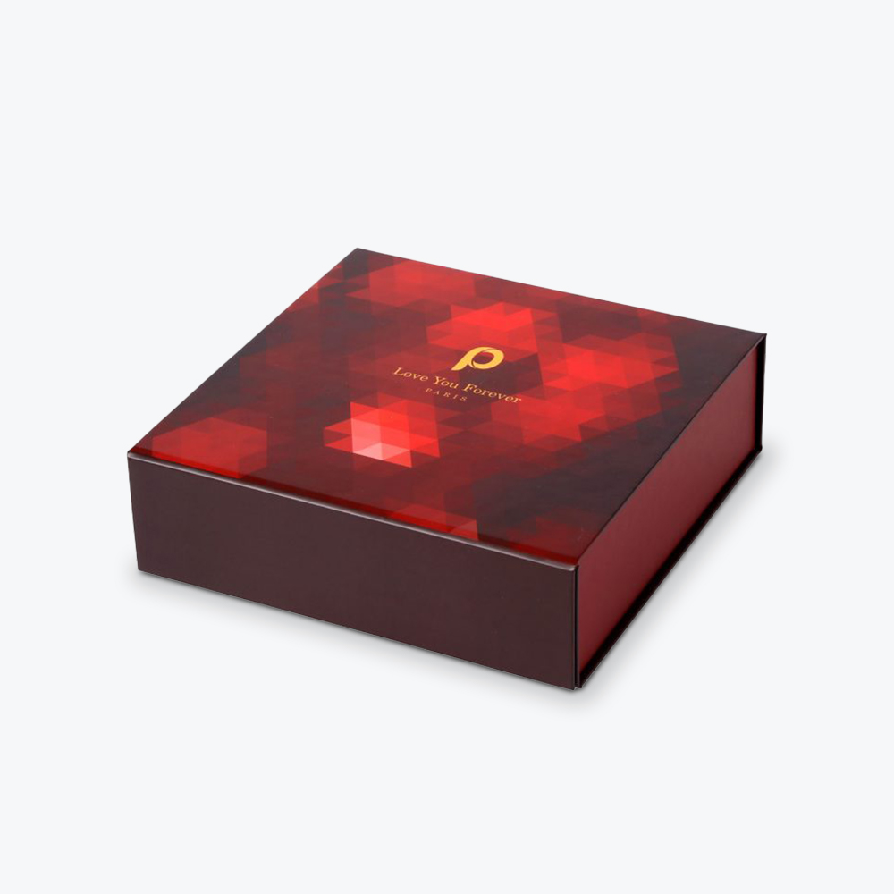
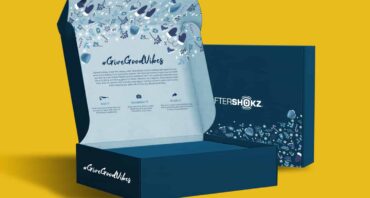
The mailer box is minimalism on the go. It offers a snug and structured haven that hugs your product without unnecessary padding. The surface can display a single bold color, a playful pattern, or just your logo. Custom printed mailer boxes are built tough and can protect your products from the bumps and bruises of transit.
3. Folding Cartons
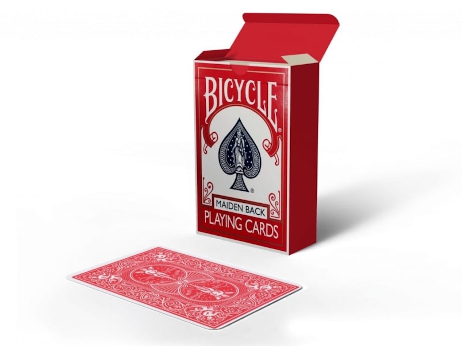
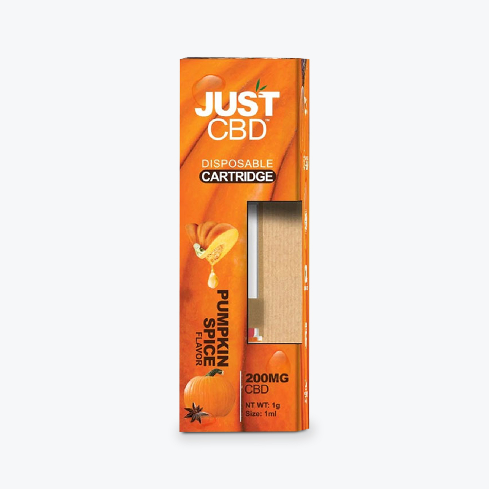
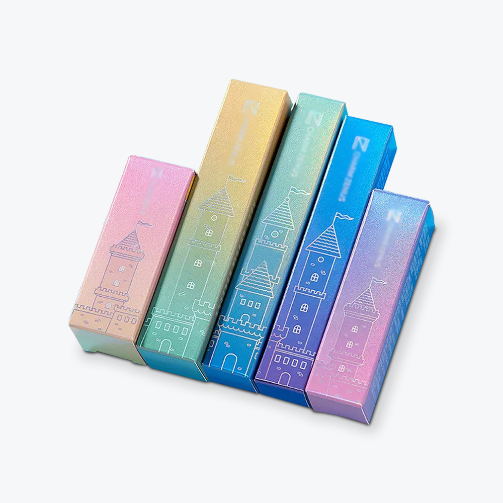
Folding cartons use precise manufacturing that involves printing, die-cutting, scoring, and gluing. Their lightweight nature means saving on shipping costs and a smaller environmental footprint.
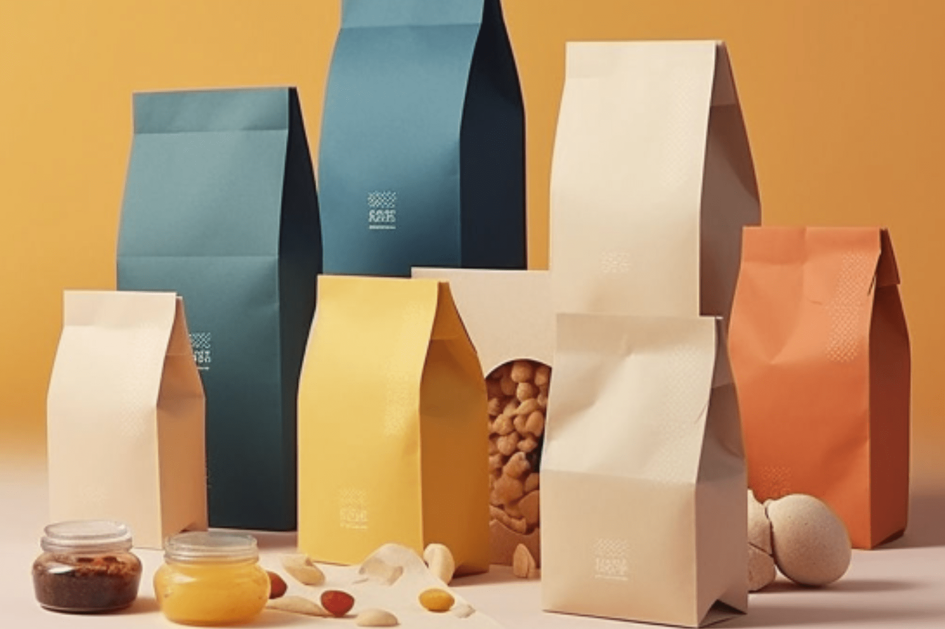
4. Bags
Bags embody flexibility, versatility, and a chic style. When crafted from paper, they give off a natural, earthy vibe. Meanwhile, fabric allows you to creatively explore textures and colors. Bags are also lightweight and easy to ship, reducing logistics costs.
3 Ideas for Minimalist Packaging Design
Here are some minimalist design ideas that you can use to better optimize your marketing campaigns:
1. Color Blocking
If you decide to use more than one color, try a clean, color-blocked approach. Select colors that connect seamlessly to your brand’s personality and help convey your message. For instance, pair sage green with soft peach to create a harmonious, calming effect.
2. Clear or See Through
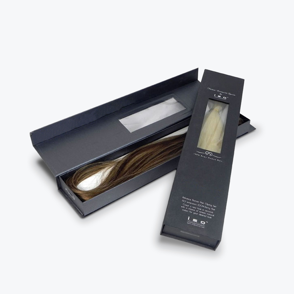
Clear packaging emphasizes that the product itself is a work of art. One of the benefits of clear or see-through packaging is its immersive user experience. Your target audience can easily see the color, texture, and quality of your product beforehand.
3. Logo Focus
Putting a strong focus on your logo improves brand recognition. The minimalist approach makes the logo identifiable among hundreds of similar products in your industry.
Minimal Packaging: Why Less Is More
We are saturated with visual noise, and it can be exhausting at times. A great antidote to loud and robust marketing is minimalist packaging. With its sleek and simple designs, minimalism catches the eye and sparks curiosity, which can serve as an effective marketing tactic.
If you plan on using minimalist packaging, keep in mind the true essence of “less is more.” It’s not the absence of design but the deliberate act of trimming excess so you can focus on your brand message. Every design decision should have a purpose, and every element should resonate with your target audience. Great minimalist packaging conveys quality, sophistication, and intention—values that speak to today’s conscious consumers.
Refine Packaging is the top choice for 1000s of small businesses, Inc 5000, and Fortune 500 companies alike when it comes to custom packaging boxes. With super fast production times, affordable pricing, and a sky’s the limit attitude, we’ll help you turn your custom packaging into a competitive differentiator. Contact us today and a dedicated packaging specialist will guide you through every step of the custom packaging process without breaking a sweat.










.svg)
Share